Mobile SEO: What you need to know and how to optimize it
Optimizing Mobile SEO on mobile devices for online stores is no longer just a good practice, it’s a necessity for any business that wants to get 100% out of its resources.
In fact, this isn’t anything new; it’s been forged gradually for years. The user’s inclination to use mobile devices was increasing exponentially, until Google decided it was necessary to change the paradigm and the way users search.
Background: the mobile first index
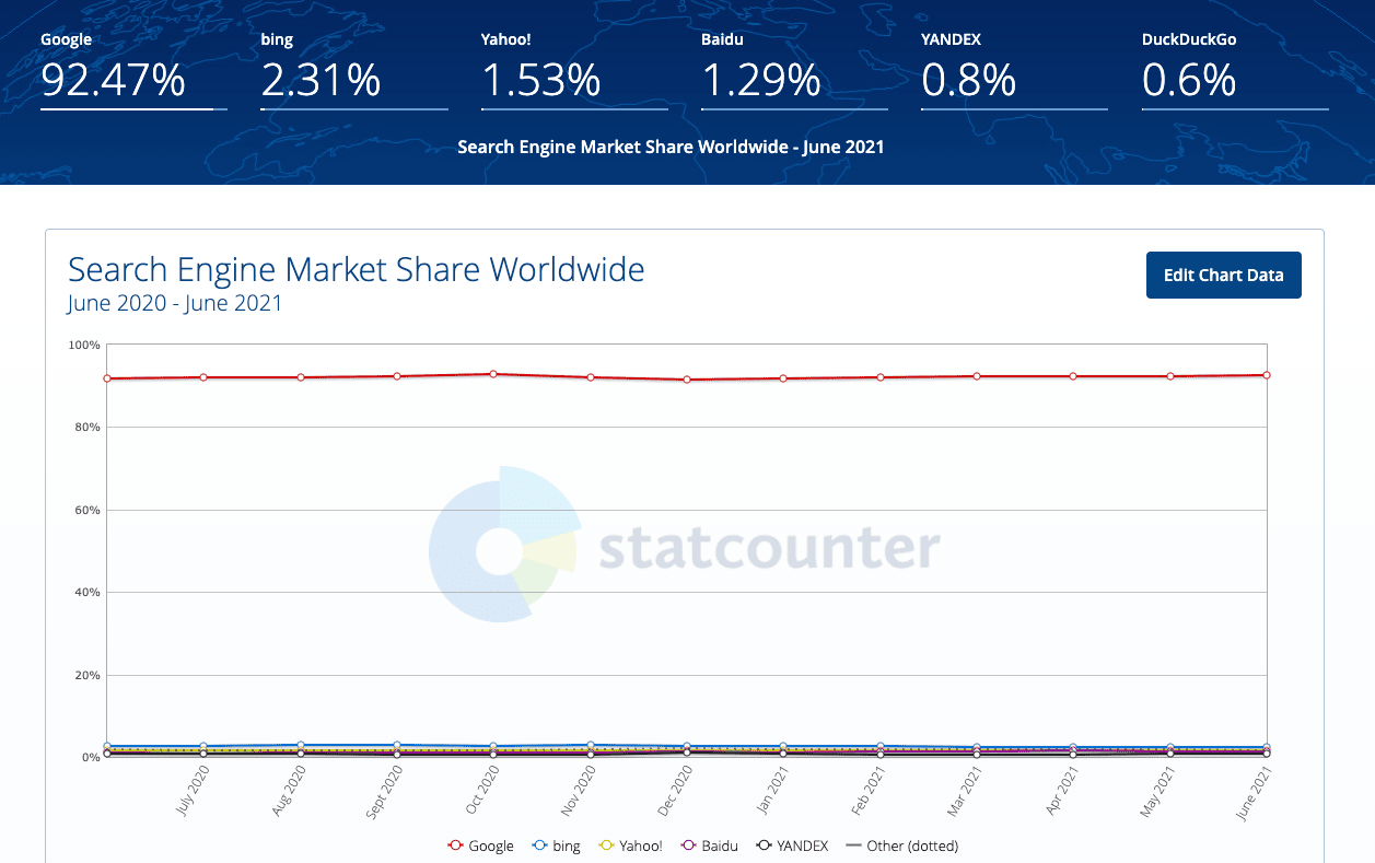
What we first mentioned in the introduction, the mobile first index, is indicating a before and after in SEO. At the end of the day, the decisions Google makes end up being the standard because of its dominant position in the market, as demonstrated by Stat Counter.

Basically, it changes the way the search engine incorporates web pages into its database. This is known as indexing, which, until now, was done based on how sites were viewed and browsed from a desktop computer.
This began to change in July 2019 and was expected to be 100% applicable in September 2020 (a period that was extended until 2021 due to the COVID-19 pandemic situation).
Tips to optimize SEO on mobile devices for eCommerce
We’ll quickly review the main aspects of mobile SEO optimization for mobile devices, with a special focus on SEO for online stores, but this is applicable to any project that needs to be adjusted to search engine guidelines.
Indexation
We actually just discussed this; it’s essential that you create your mobile store’s browsing and design with full attention to detail. Anything that’s not in the cellphone version of your store, even if it’s on the desktop, will simply not exist to Google.
Check the meta-tags to make sure you’re not blocking access to the resources that need to be indexed. If your urls are different in the mobile and desktop versions, make sure they’re not blocked with “disallow”.
The metadata, like titles and descriptions have to be identical in both versions; this homogeneity is important. Don’t forget about structured data either.
One last tip on indexing: use breadcrumbs. These chains of links serve the user in being able to chart the browsing and the search engine robots that have to compare and rank the pages.
Loading speed
This is another key aspect that puts the purchase and use experience at the center of the strategy.
Among the ranking factors that Google uses to algorithmically determine a page’s relevance, it has long included loading speed. Nobody wants to wait a few minutes for the page to load, they’ll surely leave for another more efficient store.
The best thing you can do for this is use a tool like Google’s Lighthouse . It’ll conduct a quick assessment of your website and tell you what aspects you need to improve. The good thing is that in addition to telling you the optimizable SEO points, it also gives you good practices in terms of performance, accessibility and other things.
Pay special attention to the images and make sure they have reasonable dimensions. Many times, the same images are used in printing and are weighing down the page loading, especially in phone connections.
Contents
In addition to design and browsing, content is also something to take into account. If your desktop page and the mobile version of your online store aren’t the same, some information is being lost.
In the overview exercise that’s sometimes done for mobile phone users, make sure you’re not leaving out anything critical for SEO (watch for keywords that may be left out, especially in the headings).
The same goes for images: use the correct formats supported by search engines, take care of alt text and make sure you have all the important images on both versions (desktop and mobile).
Simply to re-emphasize something very important: the mobile version trumps all. What doesn’t appear on that version will be impossible to index and it will consequently never appear in Google’s search results.
URLS on mobile
Currently, the vast majority of pages are responsive, which means they have the same urls and adapt to the browser’s dimensions. Even so, there are still stores that have different urls and work concurrently. Those cases are the most sensitive and it’s necessary to have a correlation between the two. This means there needs to be a matching page for content and it has to be correctly shown with the corresponding rel alternate and rel canonical tags. They should be written like this:
In this example, the mobile web’s URL is https://m.example.com/.

Optimizing the mobile SEO of your online store is not a particularly complicated task, it just requires a little attention to detail and basic knowledge to implement some changes.
In return, it gives us greater visibility, builds trust and a better customer experience.


